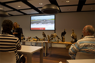
The research
Insights and observations that have driven us in the development of our concepts


Service will become a luxury for a small group of passengers.
Within 5 years service will become more important.
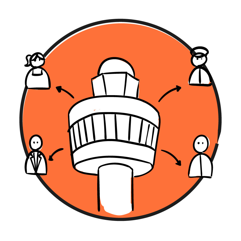
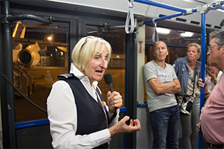
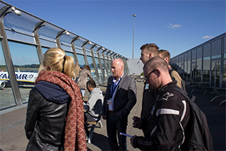
Staff will focus on different types of travelers.
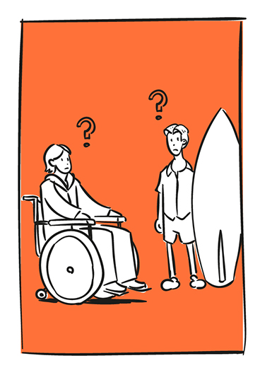
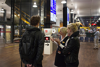
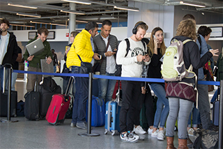
Travelers will ask questions to staff workers, even when signs are in place.
Staff may only explain to travelers what they have to do, they can't do it for them.
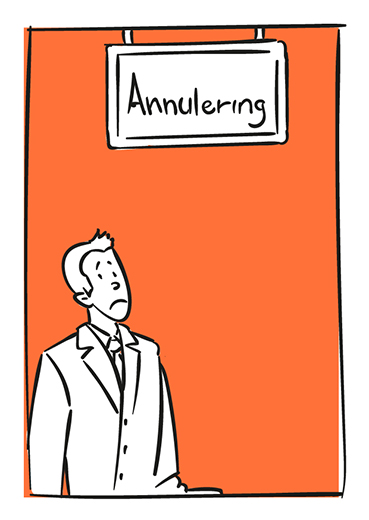
Staff workers don't always know about new information during the day.
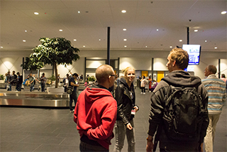
Travelers will rely upon each other when faced with unexpected events.
The longest queues are at staffed information when unexpected events happen.
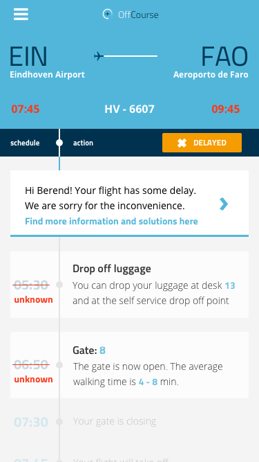
Travellers want to have instant reliable information access to be self-reliant.